Colour is one of the most powerful tools in crochet. A stitch pattern might be simple, but the colour palette can completely change the mood and feel of the finished piece. That’s why learning a little about crochet colour theory can help you design projects that look balanced, eye-catching, and intentional.
Whether you’re planning a cozy blanket, a cheerful amigurumi, or a bold accessory, understanding how colours work together will take your crochet to the next level.
Why Colour Matters in Crochet
Think about how a project makes you feel:
- A pastel baby blanket feels soft, calm, and comforting.
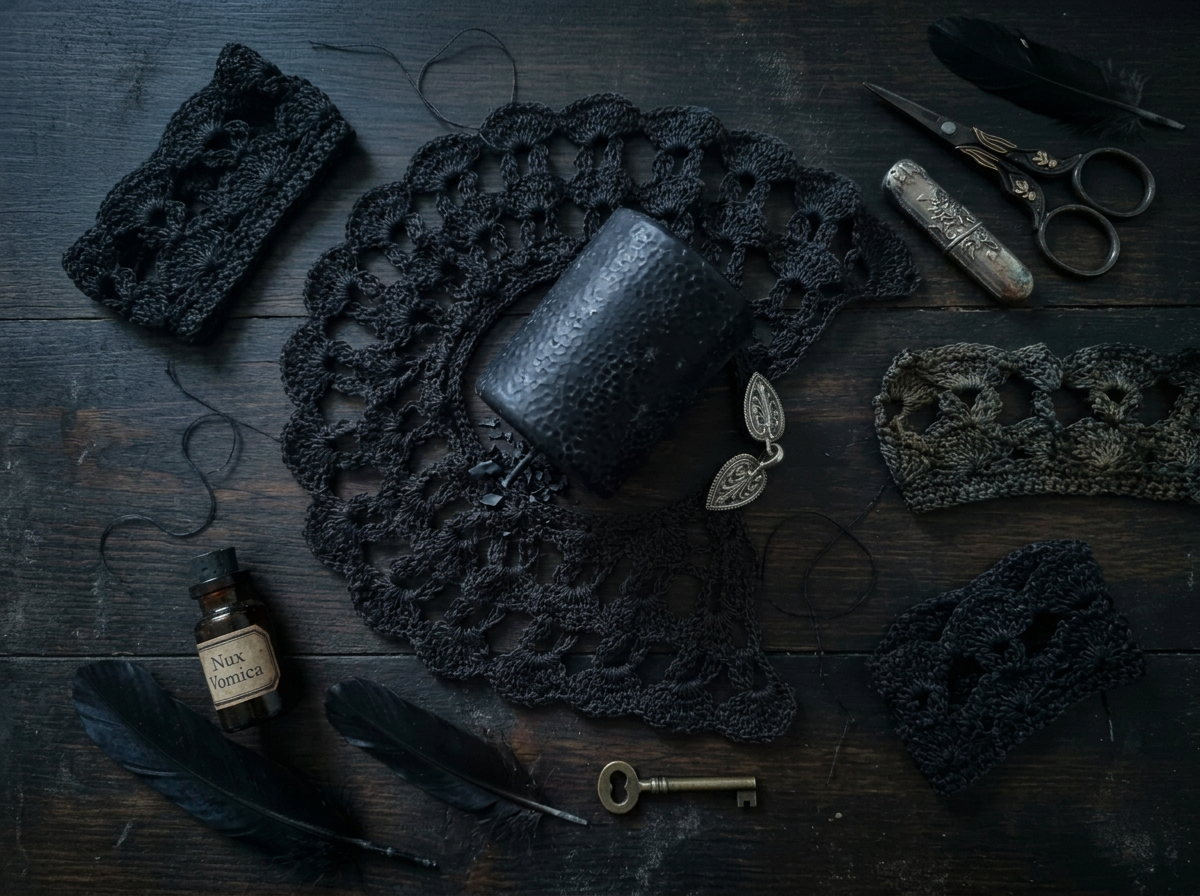
- A black-and-red scarf feels dramatic, bold, and strong.
- A rainbow granny square feels playful and full of energy.
The same stitches can create very different results depending on the colours you choose. That’s the magic of colour theory in crochet—it helps you control the mood and style of your handmade work.
The Basics of Crochet Colour Theory
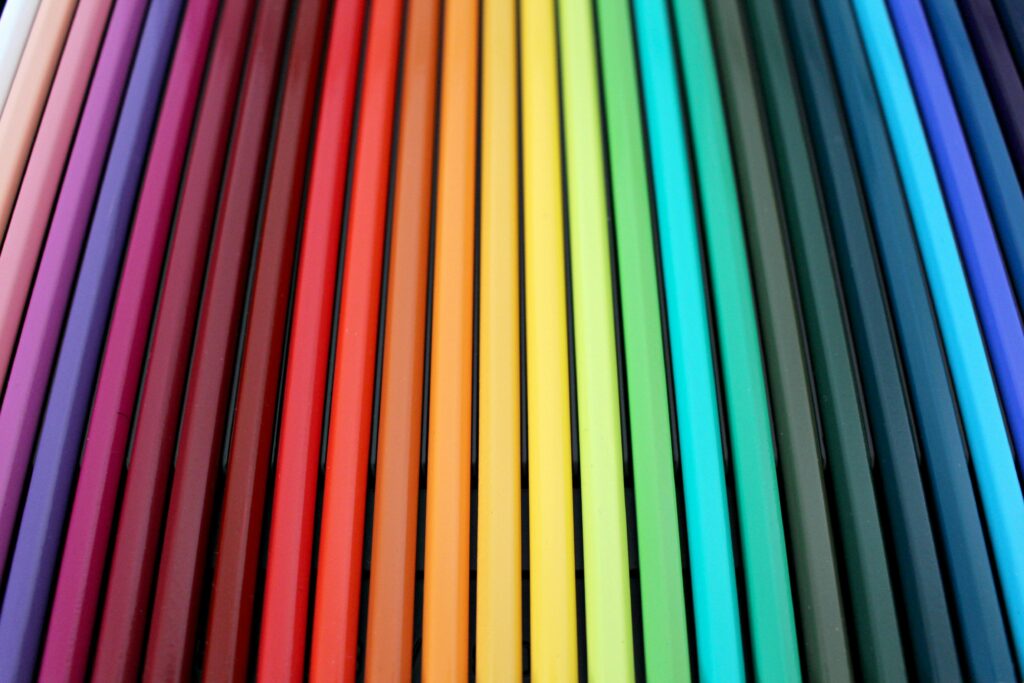
Colour theory may sound like something from an art class, but it’s really just learning how colours interact with each other. Here are the main ideas:
🎨 Complementary Colours
- These sit opposite each other on the colour wheel.
- Examples: Blue + Orange, Purple + Yellow, Red + Green.
- They create high contrast and make each other stand out.
- Great for bold designs, accents, or statement pieces.
🎨 Analogous Colours
- These are neighbours on the colour wheel.
- Examples: Blue + Teal + Green, Pink + Red + Orange.
- They look harmonious and flow naturally together.
- Perfect for soothing projects like shawls, throws, or wearables.
🎨 Monochrome Palettes
- Different shades, tints, or tones of the same colour.
- Example: Light Blue + Medium Blue + Navy.
- Gives a subtle, sophisticated look.
- Works well for minimal or modern crochet designs.
🎨 Neutral + Accent
- Combine neutral tones (grey, beige, cream, black, white) with a pop of colour.
- Example: Grey + Cream + Mustard Yellow.
- The neutrals balance out the bold colour.
- Ideal for home décor or projects you want to match easily.
Colour Combinations That Work Well in Crochet
Here are some reliable palettes to try in your projects:
- Soft & Calm: Lavender, Mint Green, Pale Grey
- Bright & Fun: Hot Pink, Turquoise, Sunshine Yellow
- Classic Contrast: Black, White, Red
- Warm & Cozy: Mustard, Rust, Cream
- Ocean Inspired: Teal, Navy, Sandy Beige
- Earthy & Natural: Olive Green, Terracotta, Warm Brown
- Modern Minimalist: White, Charcoal, Blush Pink
Practical Tips for Choosing Crochet Colours
Choosing colours isn’t just about theory—it’s also about practicality. Here’s how to make sure your chosen yarn looks great together:
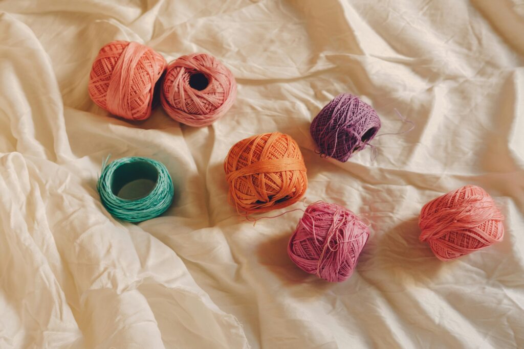
- Make Colour Swatches
Crochet a few rows of each colour together. Yarn often looks different stitched up than it does in the skein. - Look to Nature
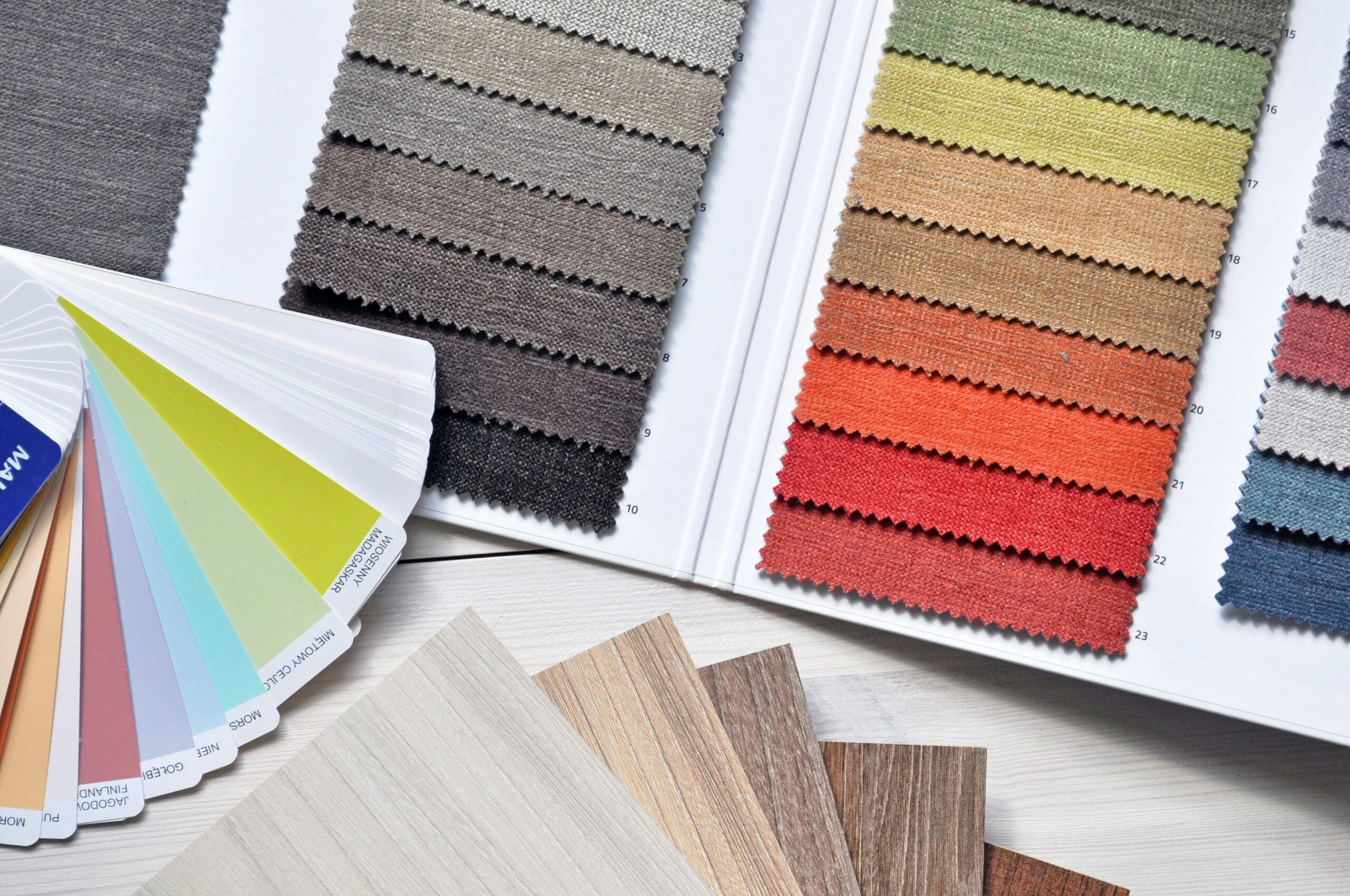
Flowers, sunsets, forests, and oceans are full of perfect palettes. Nature rarely gets colour wrong. - Use Colour Tools
Online colour palette generators, apps like Coolors or Adobe Color, and even paint swatch cards can inspire you. - Consider the Project Size
- For large items like blankets, use 3–5 colours to avoid looking busy.
- For small items like amigurumi, 2–3 colours usually work best.
- Play with Balance
Think about colour percentages. For example:- 60% main colour
- 30% secondary colour
- 10% accent colour
This creates a balanced, visually appealing design.
- Think About the Recipient
If you’re making a gift, consider the recipient’s favourite colours or home décor so the project feels personal.
Final Thoughts
Crochet colour theory doesn’t have to be intimidating—it’s simply a tool to help you bring your creative vision to life. Whether you’re experimenting with bold contrasts, calming pastels, or earthy tones, the right colours can turn simple stitches into something extraordinary.
At the end of the day, the best rule is this: if you love the colours together, they work. Trust your instincts, experiment, and let your creativity shine through every stitch.


Leave a Reply